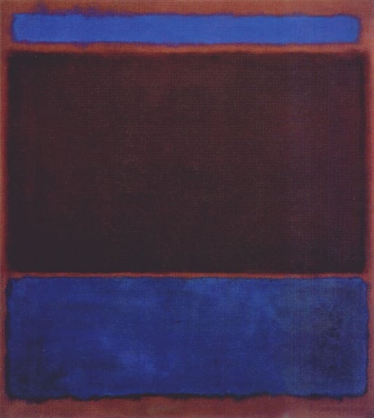
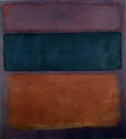
No. 3 (Bright Blue, Brown, Dark Blue on Wine)
Details
Expert analysis of Mark Rothko’s No. 3 (Bright Blue, Brown, Dark Blue on Wine)
Style: Color Field Painting · Genre: abstract
Expert Analysis of Mark Rothko’s No. 3 (Bright Blue, Brown, Dark Blue on Wine)
As a defining work of Color Field Painting, Rothko’s No. 3 exemplifies the movement’s core ambition: to use pure, unmodulated color as the primary vehicle for emotional and spiritual expression. The painting’s abstract genre is not a rejection of representation but an invitation to direct sensory experience—color becomes subject, space, and feeling.
Significance within the Style:
- Submersion in Color: The title names three specific hues—bright blue, brown, dark blue on wine—but the work transcends mere description. Rothko’s signature composition of soft, floating rectangular fields, stacked and absorbed into a glowing wine background, creates a luminous, atmospheric envelope. The colors are not confined to distinct shapes; they bleed, vibrate, and pulse against one another, embodying the Color Field principle that color alone can generate depth, light, and movement.
- Scale and Contemplation: Rothko’s canvases (typically large) physically surround the viewer. The interplay of bright blue (a leap of vitality) against the earthy brown and the deep, brooding dark blue on wine produces a tonal tension that oscillates between warmth and coolness, clarity and density. This is not decorative abstraction; it is a controlled, resonant field meant to induce a meditative state, aligning with Rothko’s stated goal of expressing “basic human emotions—tragedy, ecstasy, doom.”
- Post-Painterly Abstraction Context: As a landmark of the late 1940s–50s, No. 3 rejects the gestural energy of Abstract Expressionism in favor of calm, unified expanses. Rothko’s feathery, translucent edges (achieved through thin washes and staining) dissolve the boundary between shape and ground, making color the sole protagonist—a radical step that influenced Minimalism and later Color Field artists like Helen Frankenthaler and Barnett Newman.
Why It Matters: This painting is significant precisely because it distills Rothko’s mature vision: a non-representational, color-driven icon that demands introspection. The specific chord of bright blue, brown, dark blue on wine—a palette both somber and luminous—creates an uncanny equilibrium. It demonstrates how Color Field abstraction can achieve the sublime without narrative or symbol, relying entirely on the optical and psychological power of color relationships. In doing so, No. 3 stands as a testament to Rothko’s belief that art could be a profound, direct encounter with the ineffable.
Visually similar
20 works with related composition and palette
Earth & Green
Mark Rothko
No.20
Mark Rothko
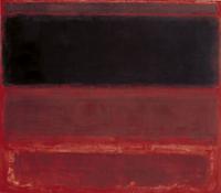
Four Darks in Red
Mark Rothko
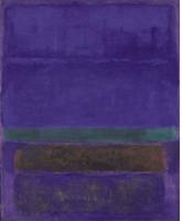
Untitled [Blue, Green, and Brown]
Mark Rothko
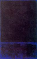
Untitled
Mark Rothko
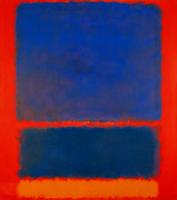
Blue, Orange, Red
Mark Rothko
Red and Orange
Mark Rothko
Untitled (Green on Blue)
Mark Rothko
Untitled (No. 17)
Mark Rothko
Untitled (Red, Blue, Orange)
Mark Rothko
Untitled
Mark Rothko
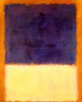
Red, Orange, Tan and Purple
Mark Rothko
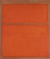
Untitled
Mark Rothko
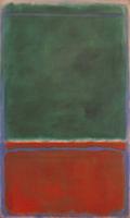
Green and Maroon
Mark Rothko
Light Red Over Black
Mark Rothko
Orange and Yellow
Mark Rothko
No. 46 (Black, Ochre, Red Over Red)
Mark Rothko
No. 1 (Royal Red and Blue)
Mark Rothko
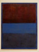
No.61 (Rust and Blue)
Mark Rothko
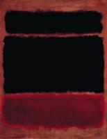
Black in Deep Red
Mark Rothko