Expertenanalyse zu Mark Rothkos Red, White, and Brown
Stil: Color Field Painting · Genre: abstract
Expert Analysis: Mark Rothko’s Red, White, and Brown (c. 1957)
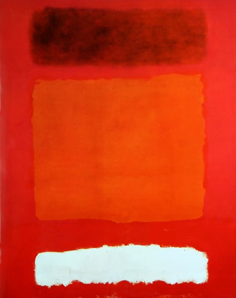
Mark Rothko’s Red, White, and Brown exemplifies the artist’s mature “classic” period, where he distilled painting to its essence: large, floating rectangles of luminous color that breathe, pulse, and seem to emit their own light. Within the Color Field movement—a branch of Abstract Expressionism that emphasized expansive, unmodulated areas of hue—Rothko stands apart for his ability to generate profound emotional and almost spiritual resonance through deceptively simple means.
Significance within Color Field Painting
- Chromatic psychology: Rothko’s triad of red, white, and brown creates a dramatic tension. The deep, earthy brown anchors the composition; the white hovers like a veil or an opening; the red—warm, arterial, yet restrained—shimmers between them. The juxtaposition is not decorative but psychologically charged, inviting the viewer into a meditative state.
- Edge manipulation: Unlike later Color Field painters (e.g., Helen Frankenthaler’s stain technique), Rothko softened his rectangular boundaries with feathery, blurred edges. In Red, White, and Brown, the white rectangle appears to vibrate against the red ground, while the brown band’s subtle halo effect prevents it from being a rigid shape. This ambiguity makes the colors feel organic, as if they breathe and shift in real time.
- Scale and intimacy: Though the facts do not specify dimensions, Rothko typically painted on a monumental scale. Yet the experience is not one of overwhelm; instead, the viewer stands before a field that seems to envelop them, fostering a private encounter. This duality—grand yet intimate—is a hallmark of his significance within the movement.
Contribution to Abstract Expressionism
Rothko’s work rejects the gestural violence of Pollock or de Kooning, replacing frenetic energy with stillness. Red, White, and Brown is a prime example of his “multiform” evolution into stacked rectangular clouds—a structure that became his signature. The composition’s vertical alignment (a typical Rothko arrangement of three color zones) creates a sense of ascending or descending light, akin to a landscape of the psyche. The brown, often read as melancholy or earthbound, contrasts with the white’s suggestion of transcendence, while the red mediates—vitality tempered by gravity.
Why This Work Endures
Rothko insisted his paintings were not about color but about “basic human emotions—tragedy, ecstasy, doom.” In Red, White, and Brown, the viewer is not told a story but is invited to feel. The work’s significance lies in its radical simplicity: it strips painting down to pure chromatic sensation and spatial presence, yet achieves an emotional weight that continues to resonate. It stands as a testament to Rothko’s belief that art could be a site of profound, wordless experience—a core tenet of Color Field’s legacy.
Visuell ähnlich
20 Werke mit ähnlicher Komposition und Farbpalette
No. 16 (Red, White, and Brown)
Mark Rothko
Untitled
Mark Rothko
Blue Over Red
Mark Rothko
No. 16
Mark Rothko
Green and Tangerine on Red
Mark Rothko
No.24
Mark Rothko
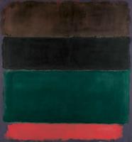
Untitled (Red-Brown, Black, Green, Red)
Mark Rothko
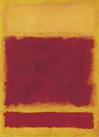
Composition
Mark Rothko
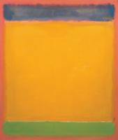
United (Blue, Yellow, Green on Red)
Mark Rothko
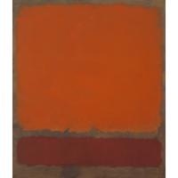
Ochre and Red on Red
Mark Rothko
No. 37/No. 19 (Slate Blue and Brown on Plum)
Mark Rothko
White Center (Yellow, Pink and Lavender on Rose)
Mark Rothko
No.10
Mark Rothko
Yellow, Charcoal, Brown
Mark Rothko
Untitled
Mark Rothko
Blue, Orange, Red
Mark Rothko
Untitled
Mark Rothko
Ochre and Red on Red
Mark Rothko
White Over Red
Mark Rothko
Red, Orange, Tan and Purple
Mark Rothko