
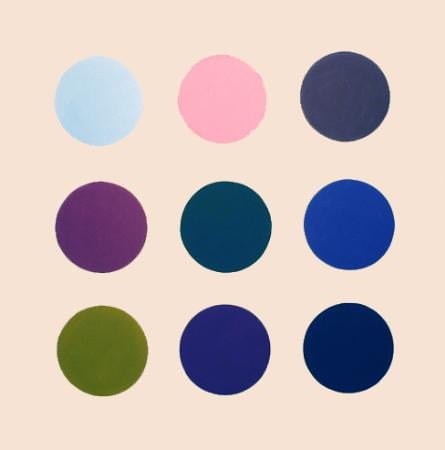
Expert analysis of Thomas Downing’s Untitled
Style: Op Art · Genre: abstract
Expert Analysis: "Untitled" by Thomas Downing
Thomas Downing’s Untitled stands as a significant contribution to Op Art and the Washington Color School, embodying the movement’s core concern with pure visual sensation. While the work is abstract, its power lies not in representation but in the systematic deployment of color and form to create perceptual effects.
Key Significance in Op Art Context:
-
Systematic Repetition and Optical Vibration: Downing is known for his meticulous arrangements of repeated circular discs or dots (often referred to as “target” or “spot” paintings). In Untitled, this repetitive geometry forces the viewer’s eye to oscillate between figure and ground, producing a subtle, rhythmic vibration. The strict, non-hierarchical grid of circles eliminates narrative depth, pushing the focus entirely onto the interaction of hues.
-
Spectral Color Relationships: Downing was steeped in Color Field theory, but he gives it an Op twist. Rather than broad washes, he uses discrete, saturated color discs. The juxtaposition of complementary or high-contrast adjacent circles (e.g., warm against cool) creates afterimages and a sense of pulsing energy. The painting “works” optically—the colors seem to advance and recede, creating an illusory space that is entirely retinal.
-
Emphasis on Pure Phenomenology: Unlike many Op artists who relied on hard-edge black-and-white patterns to induce motion, Downing’s Untitled achieves optical effects through color alone. This aligns him with artists like Richard Anuszkiewicz, but Downing’s softer, more atmospheric use of color (influenced by the Washington Color School) gives the work a lyrical, almost meditative quality. The painting is significant because it bridges the intellectual rigor of Op Art with the emotional resonance of Color Field painting.
-
Minimalist Structure, Maximal Perception: The work is radically simple in composition—no central focus, no gestural marks. Yet this very simplicity amplifies the perceptual complexity. The viewer is not told what to see; instead, the act of looking becomes the subject. This aligns with the Op Art goal of “painting that sees itself,” where the optical event is the artwork’s ultimate meaning.
Historical Placement: Downing’s Untitled is a landmark of the mid-1960s Op Art boom, particularly showcased in the The Responsive Eye exhibition (1965). It demonstrates that Op Art need not be confined to stark geometric abstraction; it can achieve its illusions through a chromatic palette that engages the eye slowly, revealing nuances of hue saturation and contrast over time. This piece underscores Downing’s unique contribution: a synthesis of systematic order and vibrant, shifting perception.
Visually similar
20 works with related composition and palette
Silver Series
Paul Brach
Nine Colors
Ellsworth Kelly
Constellations
Max Bill
Winter Honeysuckle
Anne Appleby
Color Chart No.139 1
Gerhard Richter
Kinnikinnick
Anne Appleby
Orchard Tambourine B Complete Portfolio
Terry Frost
Untitled Circle Painting: 12 multicoloured panels, no.1
Ian Davenport
Bisoprolol
Robert Hirst
Red-Green
Anne Appleby
Mulberry
Anne Appleby
Sweet Pea
Anne Appleby
Nine Squares
Ellsworth Kelly
After Duchamp
Sherrie Levine
Bleu-Vert-Jaune-Orange
Francois Morellet
Sweet Pine
Anne Appleby
Six Moments to Define Light in a Landscape
Joan Hernandez Pijuan

18 Colors (Cincinnati)
Ellsworth Kelly
Grace Kelly III
Imi Knoebel
Untitled (in 5 parts)
Gunther Forg