Friedrich Vordemberge-Gildewart sanatçısının [Season's greeting card] eseri hakkında uzman analizi
Tarz: Concretism · Tür: abstract
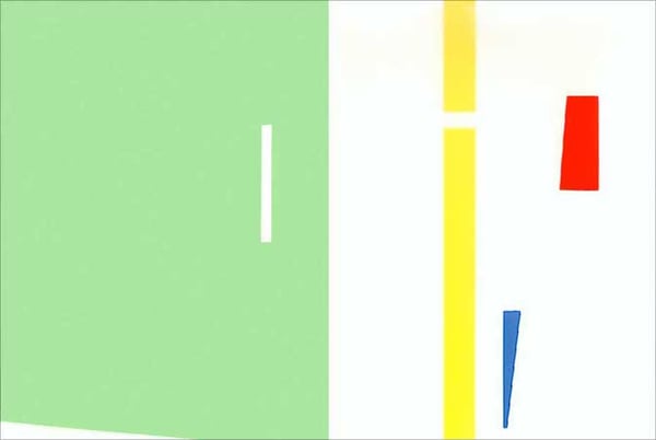
This small-format work—a seasonal greeting card by Friedrich Vordemberge-Gildewart—is a quintessential embodiment of Concretism, the radical mid-20th-century movement that rejected any reference to the natural world in favor of pure, self-sufficient form. Executed in the artist’s signature geometric abstraction, the card transforms a functional object (a holiday greeting) into a rigorous exercise in visual logic, demonstrating that even the most intimate or utilitarian artifacts can carry the full weight of avant-garde theory.
Significance within Concretism and the artist’s oeuvre:
Vordemberge-Gildewart was a founding member of the Group of Concrete Artists (Künstler der konkreten Gestaltung) and a close associate of De Stijl. This greeting card distills his mature principles: a strict, non-referential arrangement of right angles, primary colors (red, blue, yellow), and non-colors (black, white, gray), organized in a dynamic but balanced composition. The work’s significance lies in its demonstration that concrete art is not limited to large gallery canvases—it can permeate everyday life. By applying the same rigorous syntax to a card meant for personal correspondence, the artist asserts that aesthetic autonomy and mathematical harmony are universal values, not confined to “high art.”
Moreover, the card reveals the intersection of Constructivist geometry and lyrical intention. While the title “Season's greeting card” suggests a conventional message, the visual language is entirely non-representational. The arrangement of blocks and lines does not depict a winter scene, a tree, or a snowflake; instead, it generates its own meaning through spatial tension, proportion, and color contrast. This aligns with Concretism’s credo that form is content, and that the viewer’s experience should be one of immediate visual perception rather than interpretation.
Finally, the work is significant as a time capsule of interwar abstraction’s optimism. In the same decades when artists like Mondrian and van Doesburg were codifying Neo-Plasticism, Vordemberge-Gildewart produced these small, precise compositions that prove concrete principles could be adapted to any scale—from architectural murals to a humble greeting card. This piece, though modest, stands as a testament to the movement’s belief in the universal language of form and its capacity to bring order and clarity into daily life.
Görsel olarak benzer
İlişkili kompozisyon ve renk paletine sahip 20 eser
Untitled
Gerwald Rockenschaub
Work JY234
Funasaka Yoshisuke
Untitled
Yuri Zlotnikov
Composition No. 204
Friedrich Vordemberge-Gildewart
Black and Blue 3
Cesar Paternosto
Relief #169
Cesar Domela
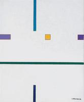
Composizione Ken 3
Luigi Veronesi
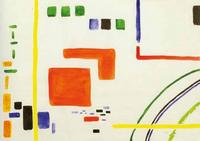
Signal series
Yuri Zlotnikov
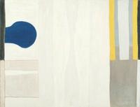
Blue Form on White
William Scott
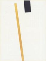
Yellow and Black Line
JCJ Vanderheyden
Untitled
Tomas Maldonado
Untitled
Friedrich Vordemberge-Gildewart
Torreon Diamond II
Ilya Bolotowsky
Untitled
Esteban Vicente
Edges
Richard Tuttle
Composition 37
Stefan Sevastre
Vertikale Komposition
Gunter Fruhtrunk
Untitled
Camille Graeser
Tension
Martha Boto
Interplay (No. 3, Second Theme)
Burgoyne Diller