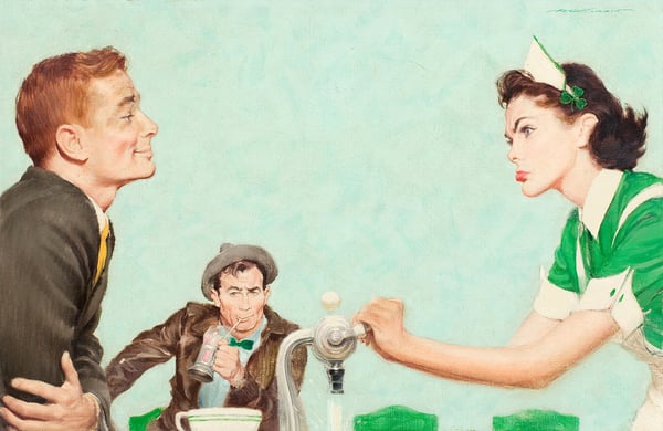
The Irishman Wouldn't Wear Green, Saturday Evening Post illustration , group of 2, March 18, 1961
Dettagli
Analisi esperta di The Irishman Wouldn't Wear Green, Saturday Evening Post illustration , group of 2, March 18, 1961 di Robert G. Harris
Stile: Poster Art Realism · Genere: illustration
Expert Analysis: "The Irishman Wouldn't Wear Green" by Robert G. Harris
This artwork, a Saturday Evening Post illustration dated March 18, 1961, exemplifies the distinctive blend of narrative clarity and visual impact that defines Poster Art Realism, a style that flourished in mid-20th-century American commercial art. Robert G. Harris here leverages the genre of illustration not merely to accompany a story, but to distill a cultural moment into a single, resonant image. The title—“The Irishman Wouldn’t Wear Green”—immediately signals a humorous twist on St. Patrick’s Day iconography, a holiday that typically demands sartorial conformity. By refusing the expected green, the subject becomes a quiet rebel, and Harris’s treatment elevates this small act of defiance into a commentary on identity, tradition, and individualism.
Significance within Poster Art Realism
Poster Art Realism, as practiced by illustrators for mass-circulation magazines like the Saturday Evening Post, required an accessible, polished realism that could communicate instantly, but also reward close looking. Harris achieves this through meticulous rendering (likely in oil or gouache) that captures lifelike textures—the tweed of a coat, the gleam of a shoe, the subtle flush of a cheek. Yet the composition is anything but documentary: it borrows the bold, graphic economy of poster design, compressing narrative into a tight frame. The figure likely occupies center stage, surrounded by symbolic elements (perhaps a parade in the background or a clashing accessory) that reinforce the title’s irony. The “wouldn’t wear green” conceit allows Harris to play with color theory, using a muted or contrasting palette—earthy browns, grays, perhaps a dash of orange or gold—to make the absence of green itself a powerful visual statement.
Cultural and Historical Context
The 1961 date places this illustration at a moment when American popular culture was both embracing and gently satirizing ethnic stereotypes. The Saturday Evening Post reached millions of households, and its covers and interior illustrations often served as a mirror of middle-class values. Harris’s choice to depict an Irishman not wearing green subverts the expected “stage Irish” trope—the red-haired, green-clad, cheerful drunk—and instead presents a figure of quiet dignity or wry stubbornness. This reflects a broader shift in the era toward more nuanced portrayals of ethnic identity, even within the constraints of commercial art. The work also stands as a testament to the skill of magazine illustrators who, before the dominance of photography, used realism and storytelling to engage readers, often with a subtle wink.
Artistic Legacy
While Robert G. Harris may not be a household name like Norman Rockwell (the Post’s most famous illustrator), his work embodies the high craft and cultural literacy required of the genre. “The Irishman Wouldn’t Wear Green” is significant because it operates on multiple levels: as a polished example of Poster Art Realism, as a humorous narrative in its own right, and as a historical artifact that captures the gentle self-awareness of Irish-American identity in early 1960s America. The tension between the title’s provocative claim and the image’s realistic, unforced demeanor is what makes this illustration memorable—a small masterpiece of visual storytelling that invites viewers to laugh, think, and appreciate the fine line between conformity and character.
Visivamente simili
20 opere con composizione e palette affini
Soda Fountain
William James Glackens
Bronze by Gold
Richard Hamilton
The Soda Jerk
Norman Rockwell
Pink Cafe
Fikret Mualla Saygi
A Bunyan-stannard Irrigation Envelope for the Treatment of Burns being applied by Sister Roberts in Middlesex Hospital
Ethel Léontine Gabain
Dance at the Casino de la Playa
Carlos Saenz de Tejada
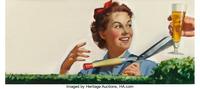
Joseph Schlitz Brewing Company Advertisement
Haddon Sundblom
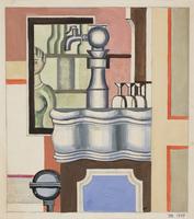
The Bar
Franciska Clausen
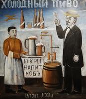
Cold beer (sign)
Niko Pirosmani
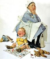
Nanny
Norman Rockwell
Hires Root Beer
Rolf Amstrong
Election Day
Norman Rockwell
Tea, lemonade, beer and liquor drinks
Niko Pirosmani
Movie star
Norman Rockwell
Sipping her Coca-Cola, Advertisement
Haddon Sundblom
In the name of mercy give!
Albert Herter
Couple Drinking
Edward Hopper
Defiant Little Girl and Onlookers (illus. for a Mans Vanity)
Haddon Sundblom
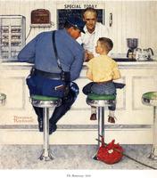
The Runaway
Norman Rockwell
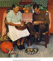
Thanksgiving Mother and Son Peeling Potatoes
Norman Rockwell