
Expertenanalyse zu Robert Cottinghams Don't Walk
Stil: Photorealism · Genre: cityscape
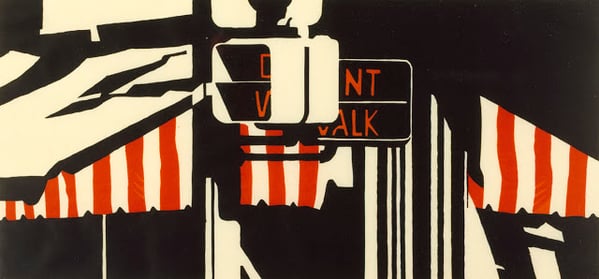
"Don't Walk" by Robert Cottingham exemplifies the Photorealist movement’s fascination with the anonymous, mass-produced visual language of American urban life. As a cityscape, the work zeroes in on a single, iconic pedestrian signal—a mundane object that becomes monumental through Cottingham’s hyper-precise technique. The significance lies in its transformation of a banal street sign into a stark, almost graphic composition, stripped of human presence yet saturated with cultural meaning. This focus on lettering and signage typifies Cottingham’s oeuvre, which elevates commercial and civic typography to the status of fine art. Within Photorealism—a style that emerged in the late 1960s as a reaction to Abstract Expressionism’s emotionalism—Don't Walk embodies the movement’s core achievement: using photographic verisimilitude to reveal the hidden beauty and psychological weight in everyday urban artifacts.
Visuell ähnlich
20 Werke mit ähnlicher Komposition und Farbpalette
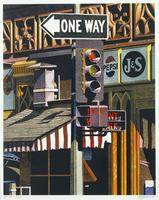
One Way
Robert Cottingham
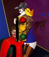
New York City IV
Richard Lindner
Barrera-Rosa
Robert Cottingham
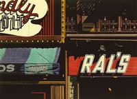
Ral's
Robert Cottingham
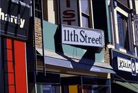
11th Street
Robert Cottingham
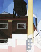
And the Home of the Brave
Charles Demuth
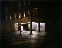
Kenmare and Elizabeth
Dan Witz
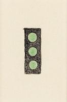
Komposition
Otto Gustav Carlsund
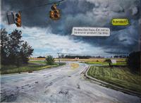
Are You Coming?
Sašo Vrabič
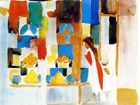
Children at the Grocery Store
August Macke
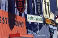
Hairstylist #18
Robert Cottingham
Tower Blocks
Frank Auerbach
Joseph's Liquors
Robert Cottingham
J&J liquor
Dan Witz
Kiss
Ilya Isupov
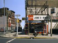
Jone's diner
Richard Estes
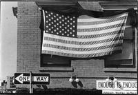
New York City
Robert Rauschenberg
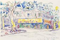
The House of Van Gogh (Arles, place Lamartine)
Paul Signac
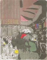
The Cake Shop
Edouard Vuillard
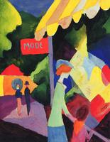
Fashion window
August Macke