
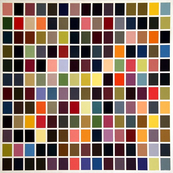
180 Colors
Expert analysis of Gerhard Richter’s 180 Colors
Style: Conceptual Art, Op Art · Genre: abstract
Expert Analysis of 180 Colors by Gerhard Richter
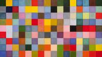
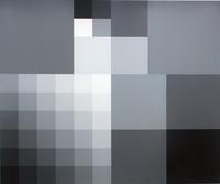
Gerhard Richter’s 180 Colors is a landmark work that straddles the boundaries of Conceptual Art and Op Art, while remaining firmly within the abstract genre. Painted in 1974, it belongs to Richter’s celebrated series of color chart paintings, which he began in 1966. In these works, Richter systematically arranged industrial paint colors in a gridded, seemingly arbitrary sequence—here, a rectangular block of 180 distinct hues (often arranged in 15 rows of 12 columns).
Significance within Conceptual Art
Richter’s color charts are a radical departure from traditional painterly expression. By using a pre-determined system (often derived from commercial paint samples or random number generators), he removes subjective choice and emotional gesture from the act of painting. This aligns with Conceptual Art’s emphasis on idea over execution: the artwork exists as a proposition about color, perception, and the nature of representation. The “concept” is that color itself is the subject, not the artist’s hand or narrative.
Significance within Op Art
At the same time, 180 Colors engages with Op Art’s interest in visual perception. The strict grid and adjacent hues create subtle optical vibrations—adjacent colors can appear to shift, shimmer, or produce afterimages when viewed peripherally. Richter exploits the inherent instability of color relationships, turning a flat, systematic arrangement into a dynamic perceptual experience. This bridges the cerebral rigor of Conceptual Art with the bodily, sensory impact of Op Art, making the painting both an intellectual framework and a visual event.
Why It Matters
180 Colors is significant because it challenges the Romantic myth of the artist as a spontaneous creator. Richter once remarked that he wanted “to have nothing to say” with these works—they are deadpan, neutral, and anti-expressive. Yet their very neutrality becomes a profound statement about painting in the age of mechanical reproduction. By adopting the look of a commercial color swatch or a printed test pattern, Richter questions the boundaries between high art and industrial design, and between hand-painted craft and mechanical precision.
The piece also prefigures later digital and conceptual art practices—its reliance on systematic algorithms and chance operations resonates with early computer-generated art. In summary, 180 Colors is a pivotal work that uses abstraction not to depict an inner world, but to investigate the very fabric of visual experience, making it a touchstone of late 20th‑century conceptual and perceptual art.
Visually similar
20 works with related composition and palette
1024 Colours
Gerhard Richter
Six systematical colour rows from bright to bright
Richard Paul Lohse
Sechs systematische Farbreihen mit blaugrünen und violetten Akzenten
Richard Paul Lohse
Episcopalian Pandemonium
Pat Lipsky
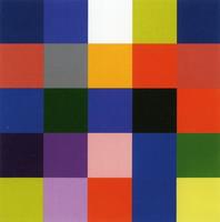
25 Colours
Gerhard Richter
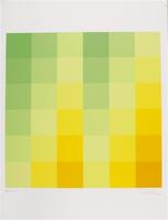
Farbfelder
Richard Paul Lohse
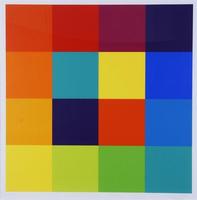
Gestufte Quadratreihe um ein Komplementärzentrum
Richard Paul Lohse
After Duchamp
Sherrie Levine
After Monet
Sherrie Levine
Johnson and Johnson Model
Robert Swain
Squares
Joan Snyder
Untitled (Pacific Coast Series #154)
Kenneth Noland
Colors for a Large Wall
Ellsworth Kelly
Modular/Seriell
Richard Paul Lohse
Stabilisierter kern
Max Bill
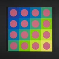
Contrasti simultanei
Mario Ballocco
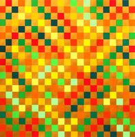
Cor-Luz
Eduardo Nery
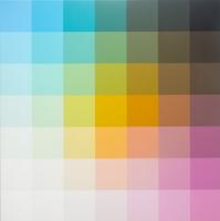
Untitled, 703, 7ft x 7ft
Robert Swain
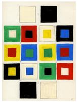
The Fourth 'Book of Schemes'. Album #2, the First Folder
Valerii Lamakh
Untitled, 10 x 12-02
Robert Swain