Expertenanalyse zu Perle Fines "Cool" Series (Dark Pink over Brown)
Stil: Color Field Painting · Genre: abstract
Expert Analysis: Perle Fine’s “Cool” Series (Dark Pink over Brown)
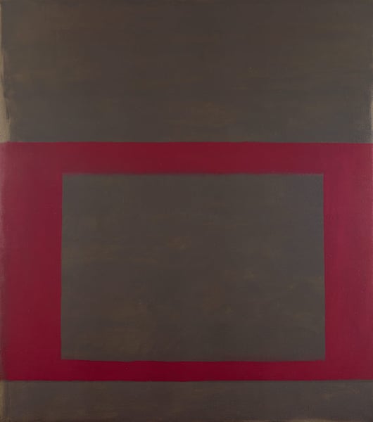
Perle Fine’s “Cool” Series (Dark Pink over Brown) exemplifies the nuanced color relationships and restrained emotional power that define Color Field Painting. As an abstract work in the Color Field style, its significance lies in three key aspects: the subversion of its own title, the artist’s technical handling of color, and her historical place within a movement often dominated by male figures.
First, the title’s “Cool” series deliberately plays against expectation. Here, Fine applies dark pink over brown—a warm, earthy duo that avoids the cool blues or greens one might anticipate. This tension between naming and palette is a hallmark of Color Field’s interest in pure sensation: the viewer is asked to feel the warmth of the layering rather than rationalize a “cool” temperature. The overlapping of dark pink onto brown creates a muted, almost bruised luminosity, demonstrating that “cool” in Fine’s hands is not about temperature but about a reserved, contemplative mood achieved through subtle tonal shifts.
Second, the work is significant for its mastery of chromatic weight and space. In Color Field Painting, the canvas is often treated as a single, unbroken field. Fine’s composition appears to be a large expanse of brown, overlaid with a veil or sweep of dark pink. The interaction between these two hues—neither fully opaque nor completely transparent—generates a sense of depth without illusionistic space. The pink seems to hover or soak into the brown, creating a vibrating boundary. This technique anticipates the later Color Field innovations of Helen Frankenthaler and Morris Louis, where stain-like applications yield a luminous, skin-like surface.
Finally, Perle Fine’s role as a female practitioner within the largely male-dominated Abstract Expressionist and Color Field circles adds to the work’s significance. While artists like Barnett Newman and Mark Rothko pursued stark, iconic color fields, Fine’s subtle layering and intimate scale (often implied by the title’s focus on a “series”) offer a more introspective, lyrical approach. “Cool” Series (Dark Pink over Brown) stands as a testament to Fine’s ability to distill emotion from a simple, two-color relationship—proving that significance in Color Field painting need not be monumental or declarative, but can reside in the quiet, deliberate resonance of pigment against pigment.
Visuell ähnlich
20 Werke mit ähnlicher Komposition und Farbpalette
"Cool" Series No. 7 (Square Shooter)
Perle Fine
"Cool" Series No. 46 (Spanking Fresh)
Perle Fine
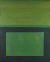
"Cool" Series (Black over Green)
Perle Fine
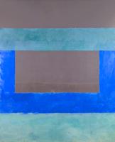
"Cool" Series No. 15 (The Very End)
Perle Fine
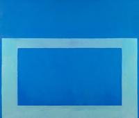
"Cool" Series No. 29 (Cool Blue, Cold Green)
Perle Fine
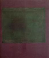
Untitled (Green on Maroon)
Mark Rothko
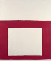
"Cool" Series No. 1 (Red over White)
Perle Fine
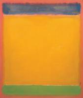
United (Blue, Yellow, Green on Red)
Mark Rothko
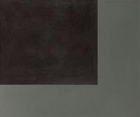
Cornerfield Painting XLIX
Helmut Federle
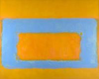
"Cool" Series No. 36 (Rough-Hewn)
Perle Fine
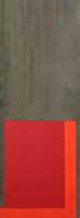
4.5.68
John Hoyland
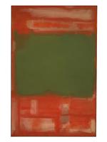
No.24
Mark Rothko
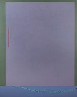
Infinity Field, Nemea Series #4
Theodoros Stamos
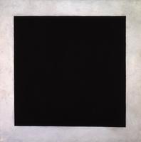
Black Square (2nd version)
Kazimir Malevich
Envoi
Anne Truitt
No. 2
Mark Rothko
No. 16
Mark Rothko
Green and Tangerine on Red
Mark Rothko
No. 8
Mark Rothko
"Cool" Series No. 2 (Yellow over Tan)
Perle Fine