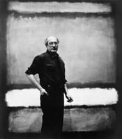
Expert analysis of Mark Rothko’s No. 5
Style: Minimalism · Genre: abstract
Expert Analysis of "No. 5" by Mark Rothko
While Mark Rothko is historically aligned with Abstract Expressionism and Color Field painting, the provided facts classify this work under Minimalism—a designation that reframes the painting’s significance through the lens of radical reduction, pure abstraction, and the primacy of material presence.
Context within Minimalism
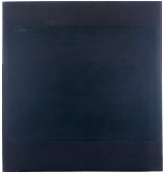
Minimalism emerged as a reaction against the gestural intensity of Abstract Expressionism, stripping art down to its essential components: shape, color, scale, and surface. In "No. 5," Rothko’s signature soft-edged rectangular fields are here interpreted as Minimalist modules—simple, non-hierarchical bands that occupy the canvas without narrative or symbolic reference. The work’s power lies in its uncompromising simplicity: a few floating color zones that deny depth or illusion, insisting on the flatness of the picture plane.
Significance in the Minimalist Period
- Radical Reduction: "No. 5" embodies Minimalism’s drive to eliminate excess. Rothko’s composition is pared to two or three luminous rectangles suspended against a darker ground. There is no brushstroke drama, no recognizable imagery—only the direct encounter between color and scale. This reduction forces the viewer to confront the work as an object rather than a window.
- Scale and Immersion: Like many Minimalist works (e.g., those of Donald Judd or Agnes Martin), "No. 5" is large enough to envelop the viewer’s peripheral vision. This scale transforms the painting into an environment, a field of sensory experience that prioritizes perception over interpretation.
- Color as Substance: In Minimalism, color is not symbolic but physical. Rothko’s veiled layers of thinned paint create a breathing, atmospheric surface that seems to glow from within—a testament to the materiality of paint itself. The subtle tonal variations, though seemingly minimal, generate a profound emotional resonance, proving that even the barest means can evoke depth.
What Makes It Significant
- Bridge Between Movements: While typical Minimalism (e.g., Stella’s striped canvases) is hard-edged and cool, "No. 5" offers a warmer, more intuitive variant. It demonstrates that Minimalism need not be impersonal; Rothko’s floating rectangles retain an almost spiritual luminosity, making the work a pivotal link between the sublime aims of Abstract Expressionism and the stringent objecthood of later Minimalism.
- Emphasis on Viewer: The painting functions as a perceptual trigger—the blurred edges of the forms create optical vibration and a sense of pulsating light. This viewer-dependent experience aligns with Minimalism’s goal of shifting attention from the artist’s hand to the viewer’s direct encounter.
In summary, "No. 5" is significant within Minimalism as a masterful reduction of form to its most elemental state, where color, scale, and surface collaborate to produce an immediate, meditative presence. It challenges the assumption that Minimalism must be cold or mechanical, proving that radical simplification can still yield profound emotional and sensory impact.
Visually similar
20 works with related composition and palette
No. 2
Mark Rothko
No. 7
Mark Rothko
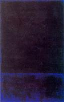
Untitled
Mark Rothko
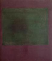
Untitled (Green on Maroon)
Mark Rothko

Untitled
Mark Rothko
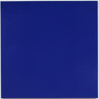
Painting No. 97—23 (Ultramarine Blue, Zinc White, Ruby Lake)
Rudolf de Crignis
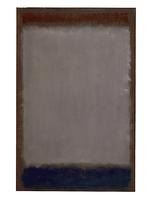
Lavender and Mulberry
Mark Rothko
Envoi
Anne Truitt
No. 8
Mark Rothko
Green and Tangerine on Red
Mark Rothko
Untitled 29.8.87
Bob Law
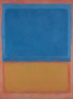
Untitled (Red, Blue, Orange)
Mark Rothko
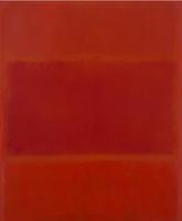
Red and Orange
Mark Rothko
Ochre and Red on Red
Mark Rothko
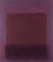
Purple Brown
Mark Rothko
Black Square (3rd version)
Kazimir Malevich
Ujpest
Doug Ohlson
Blue Space
Virginia Jaramillo
Ochre and Red on Red
Mark Rothko
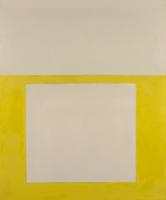
"Cool" Series No. 2 (Yellow over Tan)
Perle Fine