Description
Style: Color Field Painting, Minimalism · Genre: abstract
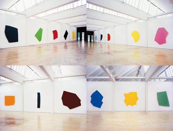
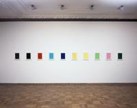
24 Farben-für Blinky (24 Colors—for Blinky) was executed in 1977, shortly after the untimely death of Imi Knoebel's close friend, the German painter Blinky Palermo. For Knoebel, this moment proved significant. Personal loss was experienced in the form of artistic legacy: a bequest from a peer renowned for his gifts as a colorist. Yet, up to that moment, Knoebel had, in contrast to his friend, strictly confined his palette to white and black monochrome fields or, more often, as seen in Raum 19 (Room 19), 1968, depended on the warm natural hues of Masonite. Indeed, Knoebel's fascination with Masonite board had meant that for the first decade of his career, he was more often considered a sculptor than a painter proper. Raum 19 was, like all his works at that time, conceived in materialist terms. The fundamentals of both sculpture and painting comprise its formal language: planar surfaces, supports and stretchers to be stored or stacked, volumetric solids and plastic geometric elements. Tellingly, those features more commonly associated with the pictorial aspects of painting-illusionistic space and the disposition of colored shapes across a flat field-are absent.
When adopting color for the first time in 1977, Knoebel steadfastly held to his materialist aesthetic. Each component in this epic series is a monochrome polygon. Eschewing familiar geometric shapes, such as rectangles, squares, rhomboids, or trapezoids, Knoebel has conceived each complex form as a unique entity that defies easy identification. Similarly, while each hue is indubitably specific, the collective effect exceeds what can be readily remembered; the result is that in this series color is not used conventionally. Less an expressive or referential device, it assumes an abstract character, which in its polyphony comes to signify color tout court. In these and related ways, Knoebel at once extended his ongoing elliptical investigation into the identity of painting and, for the first time, embraced what is traditionally considered its quintessential feature-color-at its most vital and intense.
While this monumental cycle was generated in part in homage to a deceased friend, it nonetheless proved seminal for the artist: it has become the fountainhead in an ongoing investigation that today spans more than thirty years into the multifarious and complex roles color may assume in a contemporary practice. (Lynne Cooke)
Visually similar
20 works with related composition and palette
Monochrome Painting: A Posteriori Prototype: Average Size
Stephen Prina
Toiles à l’unité/Légendes
Claude Rutault
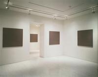
Installation view
Gaylen Gerber
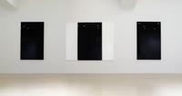
Orange, Black Painting with Blue Edge, and Burgundy
Robert Irwin
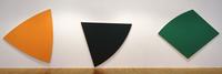
Three Panels. Orange, Dark Gray, Green
Ellsworth Kelly
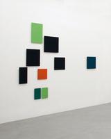
Territorium 25
Gunter Umberg
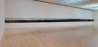
Morning Chapter 30 (installation view)
R.H. Quaytman
Installation view
Bruno Jakob
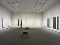
Stations of the Cross
Barnett Newman
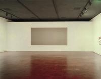
Cumo
James Turrell
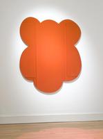
MONKEY (Red-Orange)
Jeff Koons
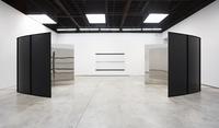
static balance
Carsten Nicolai
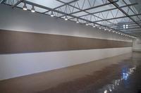
Installation view
Gaylen Gerber
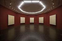
The White Room (About T. S. Eliot)
Pedro Cabrita Reis
Work No. 373
Martin Creed
Installation views
Edward Krasinski
Stanza, Giallo Oro
Ettore Spalletti
Untitled/Exquisite Corpse: The Complete Paintings of Manet 227 of 556 Baigneuses en Seine (Bathers in the Seine) 1874?
Stephen Prina
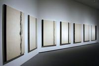
Stations of the Cross 1958 1966
Barnett Newman
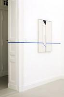
Intervention
Edward Krasinski