
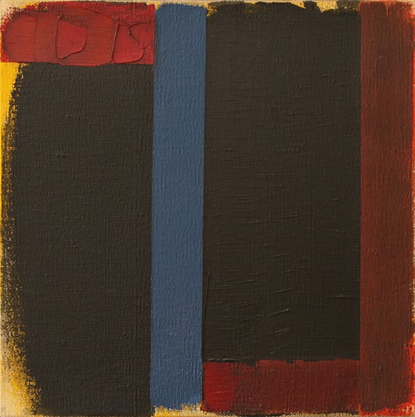
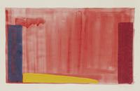
Expert analysis of Doug Ohlson’s Monsignor (Study)
Style: Color Field Painting · Genre: abstract
As an expert in Color Field Painting, I can provide an analysis of Doug Ohlson's "Monsignor (Study)" based on the structured facts and the artist's known contributions to the movement.
Artwork: Monsignor (Study)
Artist: Doug Ohlson (1936–2010)
Style: Color Field Painting
Genre: Abstract
Significance within Color Field Painting
Doug Ohlson is a significant, though sometimes underrecognized, figure within the second generation of the Washington Color School—a regional branch of Color Field painting centered in Washington, D.C. in the 1960s. This movement, led by artists like Morris Louis, Kenneth Noland, and Gene Davis, prioritized the optical effects of pure, unmodulated color applied directly to unprimed canvas through staining. Ohlson, a protégé of Noland, developed a distinctive vocabulary of geometric, often modular forms that float within a field of luminosity.
"Monsignor (Study)" is notable for several reasons:
-
Process and Materiality: The word "Study" suggests a preparatory work, but in Ohlson’s practice, such studies were often finished explorations of color relationships. Like his peers, Ohlson likely used thinned acrylic paint to stain raw canvas, allowing the fabric’s weave to absorb color and create a seamless, matte surface. This technique eliminates brushstrokes and illusionistic depth, forcing the viewer to engage with color as a physical, optical phenomenon.
-
Structural Innovation: Ohlson frequently employed repetitive, iconic shapes—such as vertical bands, chevrons, or in this case, possibly a centralized emblem (the "Monsignor" title might evoke a clerical collar or heraldic symbol). The "Study" format allows the artist to test the interplay between a crisp, symmetrical motif and an expansive, monochromatic or subtly modulated ground. This tension between figure and field—where the figure does not recede but vibrates on the same plane—is a hallmark of post-painterly abstraction.
-
Color as Subject: In Color Field painting, hue, saturation, and value become the primary content. Ohlson’s palette is known for its bold, often unexpected juxtapositions—bright reds, deep blues, and acidic greens—that generate a sense of luminosity and atmospheric space without traditional perspective. "Monsignor (Study)" likely exemplifies this, with color relationships that oscillate between harmony and dissonance, creating a visual experience that is both immediate and contemplative.
Contribution to the Movement
Ohlson’s work bridges the first-generation Washington Color School’s soaked, amorphous color stains and the later, more geometric tendencies of Hard-Edge painting. By reducing composition to a single, emblematic image (often a cross, a medallion, or a column), he introduced a symbolic or even architectural dimension to Color Field’s otherwise non-referential language. "Monsignor (Study)" thus stands as a testament to his ability to marry systemic structure with sensuous color, a synthesis that remains a critical milestone in the evolution of American abstract painting.
In summary, this study is significant not only as a window into Ohlson’s working method but also as a refined example of how Color Field artists continued to push the boundaries of color perception, flatness, and pure opticality well into the late modern period.
Visually similar
20 works with related composition and palette
Paris Green
Doug Ohlson
Yellow, Cherry, Orange
Mark Rothko
Untitled
Michel Carrade
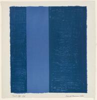
Canto VII
Barnett Newman
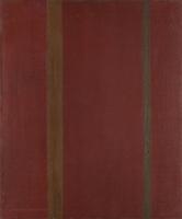
Galaxy
Barnett Newman
Untitled
Ivan Serpa
Orange No.1
Basil Beattie
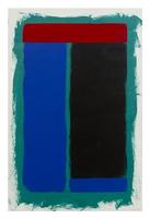
Two-Four
Doug Ohlson
Umber Black
Yun Hyong–keun
28.5.66
John Hoyland
Burnt Umber & Ultramarine Blue
Yun Hyong–keun
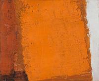
Summer
Joe Tilson
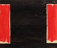
Untitled (04.B.0122)
Gunther Forg
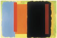
Peep Show
Doug Ohlson
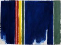
Atmospheric Effects I
Alma Woodsey Thomas
Monocromo blu
Mario Schifano
Untitled
Yun Hyong–keun
Untitled
Ivan Serpa
Contra-Composition VII
Theo van Doesburg
Untitled
John Hoyland