
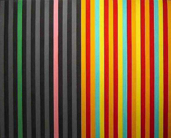
Expert analysis of Gene Davis’s Hot Susan
Style: Color Field Painting · Genre: abstract
Expert Analysis: "Hot Susan" by Gene Davis
Gene Davis’s “Hot Susan” is a consummate example of Color Field painting, a movement that emerged in the mid-20th century as part of Abstract Expressionism’s second wave—but with a crucial difference: Color Field artists rejected gesture and emotional outburst in favor of large, simplified areas of color meant to envelop the viewer. Davis, a leading member of the Washington Color School alongside Morris Louis and Kenneth Noland, made his signature contribution through the systematic use of vibrant, vertical stripes.
What makes “Hot Susan” significant:
-
Pure Color as Subject:
In Color Field painting, color itself becomes the protagonist. “Hot Susan” eliminates any representational or narrative content. The painting’s meaning is generated entirely by the relationship between adjacent hues—their temperature, intensity, and optical vibration. The “hot” in the title likely refers to the aggressive, advancing effect of warm reds, oranges, or pinks (typical in Davis’s palette), which seem to pulse forward against cooler or darker stripes. -
The Stripe as a Radical Format:
Davis is renowned for reducing painting to a single, elemental structure: repeated vertical bands of equal or varied width. In “Hot Susan,” this repetition creates a rhythmic, almost musical cadence. The stripes deny illusionistic depth, insisting on the flatness of the canvas—a core Color Field tenet. Yet the eye cannot rest; it is forced to scan left and right, creating a temporal experience of color sequences. -
Optical and Psychological Intensity:
The painting’s significance lies in its ability to produce a physical response in the viewer. By placing complementary or high-contrast colors edge to edge, Davis induces afterimages, flicker, and a sense of vibration. “Hot Susan” pushes this effect to a near-hypnotic state, making the canvas feel alive. The “hot” also suggests a sensual, almost aggressive energy—color as heat rather than light. -
Monumentality within a Minimal Vocabulary:
Davis worked on canvas sizes that often rival billboards (many of his stripe paintings are huge). Even if “Hot Susan” is smaller, its structure implies expansion beyond the frame. The repetition suggests an infinite grid of color, a radical break from the centered composition of earlier abstraction. This openness aligns with the Color Field goal of creating a “field” that the viewer can enter, rather than a window to look through. -
Dialogue with Music and Jazz:
Davis was influenced by jazz, and his stripe paintings are often described as “visual jazz”—improvisational yet structured. “Hot Susan” might evoke the syncopation and solo-like color bursts of bebop. The title itself (a woman’s name) humanizes the abstraction, hinting at personality, heat, and improvisation.
In context:
Color Field painting was a pivotal step toward minimalism. Davis’s stripes, however, retain a hand-painted, uneven quality that distinguishes them from hard-edge geometric abstraction. “Hot Susan” embodies the Washington Color School’s celebration of stained canvas and brilliant, unmodulated color. Its significance is not in storytelling but in training the eye to see color as a physical, emotive, and spatial force—an experience that, for Davis, was pure and direct.
Visually similar
20 works with related composition and palette
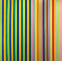
Solar Skin
Gene Davis

Firebox
Gene Davis
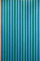
Pink Stripe
Gene Davis
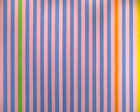
Sweet Score-Skylark
Gene Davis
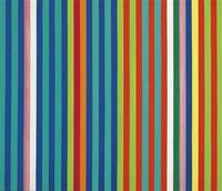
Orange Twitter
Gene Davis

Seriel bleu-ocre
Guido Molinari
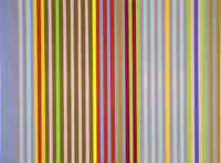
Apricot Ripple
Gene Davis
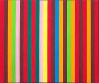
Sour Ball Beat
Gene Davis
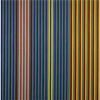
Split Beat
Gene Davis
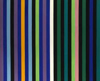
Two Part Blue
Gene Davis

Mohawk
Gene Davis
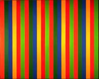
Mutation serielle verte-rouge
Guido Molinari
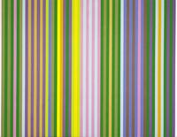
Zebra
Gene Davis
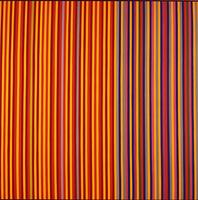
Equinox
Gene Davis

Black Grey Beat
Gene Davis
Halifax
Gene Davis

Lemon Ice
Gene Davis
Untitled (P280)
Gene Davis
Powwow
Gene Davis
Sweet Carburetor
Gene Davis